
Author Archives: Peter Avey

How to Choose a Web Designer for Your Small Business: 9 Questions to Ask First

Hiring the wrong web designer can cost you thousands of dollars, months of wasted time, and a website that quietly drives customers away instead of attracting them. Yet most small business owners pick a designer based on price alone or a flashy homepage screenshot, then regret it later.

This guide cuts through the noise. Below you’ll find a practical, no-nonsense framework on how to choose a web designer who actually fits your business, your budget, and your long-term goals. We’ve worked with hundreds of small businesses, and these are the exact questions and red flags we’d want a friend to know before signing any contract.

Why Choosing the Right Web Designer Matters More Than Ever

Your website is no longer a digital business card. It’s your storefront, your salesperson, and often the first impression a customer has of your brand. In 2026, with AI-generated sites flooding the market and template fatigue setting in, the gap between a good designer and a bad one has never been wider.

A great web designer brings three things to the table:

  • Strategy – they understand your business goals, not just colors and fonts
  • Craft – they build sites that load fast, convert visitors, and rank on Google
  • Communication – they keep you informed without burying you in jargon

Miss any of these three, and you’ll likely end up rebuilding your site within 18 months.

Freelancer, Agency, or Boutique Studio: Which One Is Right for You?

Before you start interviewing designers, decide what kind of partner you actually need. Each option has trade-offs.

Type Best For Typical Budget Watch Out For
Freelancer Simple sites, tight budgets $1,500 – $7,000 Single point of failure, slower turnaround
Boutique Studio Brand-driven small businesses $5,000 – $20,000 Limited capacity, longer waitlists
Full Agency Complex projects, e-commerce, multi-channel marketing $15,000 – $100,000+ Higher overhead, junior staff doing the work

The 9 Questions to Ask Before Hiring a Web Designer

Once you’ve shortlisted two or three candidates, run them through these nine questions. The answers will tell you almost everything you need to know.

1. Can I see three live websites you’ve built for businesses like mine?

Mockups on Dribbble are easy. Live, working websites are the truth. Ask for URLs, then test them on your phone, check load speed on PageSpeed Insights, and click around. If they hesitate to share live work, that’s your first red flag.

2. Is the site custom-designed or built on a template?

Neither answer is automatically wrong. A smart customization of a quality template can deliver excellent results for a fraction of the cost. But you deserve to know what you’re paying for. A designer charging $10,000 for a lightly tweaked template is overcharging.

3. What does your design process actually look like?

A solid process usually includes:

  1. Discovery and goals workshop
  2. Sitemap and content planning
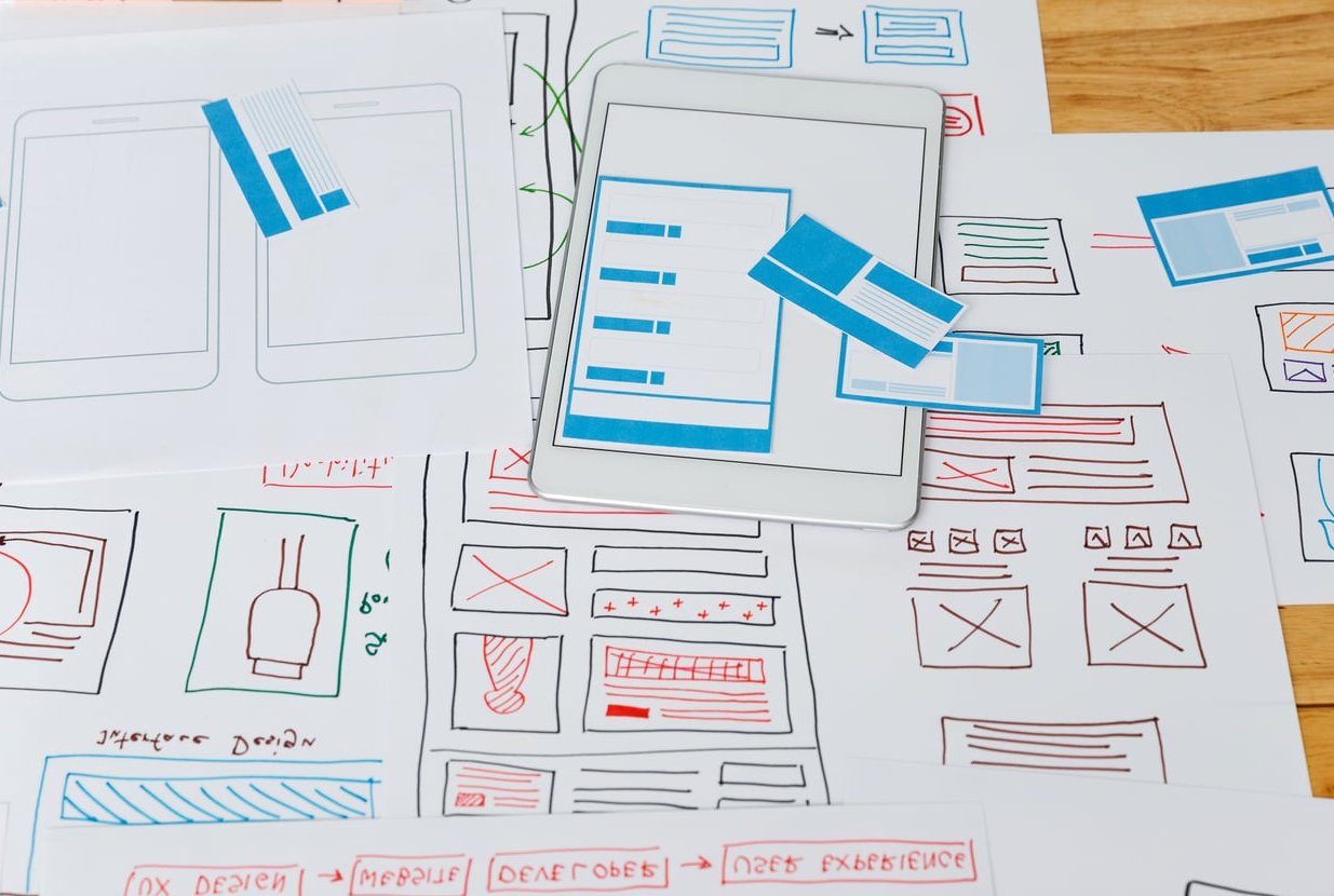
  3. Wireframes
  4. Visual design
  5. Development
  6. Testing and launch
  7. Post-launch support

If they jump straight from “send me your logo” to “here’s your homepage,” they’re skipping the strategic thinking that makes websites actually convert.

4. What’s included in the price, and what isn’t?

Pricing transparency is non-negotiable. Get a written breakdown that clearly answers:

  • How many pages are included?
  • How many revision rounds?
  • Is copywriting included or do I provide it?
  • Are stock photos and licenses included?
  • Is hosting and domain setup part of the deal?
  • What about SEO basics, analytics, and forms?

5. Who owns the website when we’re done?

You should. Always. If a designer keeps the domain, hosting, or codebase hostage, walk away. You should receive admin credentials, full files, and the ability to migrate elsewhere if you ever choose to.

6. How will you handle SEO and site speed?

A beautiful site that takes 8 seconds to load is a liability. Ask about:

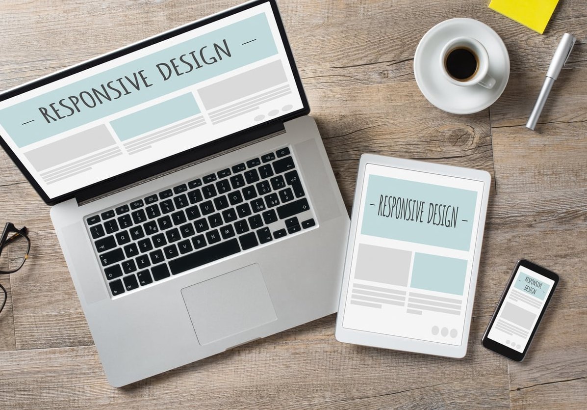
  • Mobile responsiveness and Core Web Vitals
  • On-page SEO basics (meta tags, schema, headings, alt text)
  • Image optimization
  • Clean URL structure

7. What happens after launch?

A website is software, and software needs maintenance. Find out:

  • Do they offer a care plan?
  • What’s the hourly rate for small updates?
  • How quickly do they respond to support requests?
  • Will they train you to make basic edits yourself?

8. How do you communicate during the project?

Some designers love Slack. Others prefer weekly Loom videos or scheduled Zoom calls. Neither is wrong, but a mismatch in communication style will drive you crazy. Agree on tools, frequency, and response times before the project starts.

9. Can I talk to two of your past clients?

Testimonials on a website are curated. A 10-minute phone call with a real past client is gold. Ask those clients:

  • Did the project finish on time and on budget?
  • How did the designer handle disagreements?
  • Would you hire them again?

Red Flags to Avoid When Choosing a Web Designer

Some warning signs are subtle. Others are flashing in neon. Here’s what should make you pause:

  • No written contract – handshake deals lead to lawsuits
  • Demands 100% payment upfront – a 30-50% deposit is standard, full prepayment is not
  • Can’t explain their pricing – vagueness now means surprise invoices later
  • Promises #1 Google rankings – nobody can guarantee that, period
  • Portfolio looks identical across clients – they’re using the same template for everyone
  • Slow or scattered communication during the sales phase – it only gets worse after they’re hired
  • Won’t put you in touch with past clients – they probably can’t
  • Pressure tactics or fake urgency – “this price is only good today” is a sales gimmick, not professionalism

How to Review a Web Designer’s Portfolio Like a Pro

Most people scroll through portfolios looking for things that “look nice.” That’s not enough. Instead, evaluate each project against these criteria:

  • Variety – do they have range, or does every site look the same?
  • Relevance – have they worked in your industry or with similar business sizes?
  • Performance – run two or three of their live sites through PageSpeed Insights
  • Mobile experience – pull them up on your phone, not just your laptop
  • Conversion design – are calls to action obvious? Is the navigation intuitive?
  • Longevity – are the sites they built three years ago still online and looking solid?

Setting a Realistic Budget in 2026

Web design pricing varies wildly, and cheaper isn’t always worse, just like expensive isn’t always better. Here’s a realistic snapshot of what small businesses are paying right now:

Project Type 2026 Price Range
Basic 5-page brochure site $2,000 – $6,000
Custom small business site (10-20 pages) $6,000 – $18,000
E-commerce site (Shopify or WooCommerce) $8,000 – $35,000
Custom web application $25,000+
Monthly care plan $50 – $300/month

Final Decision Checklist

Before signing anything, make sure you can confidently check every box below:

  • I’ve reviewed at least three live sites from this designer
  • I’ve spoken with at least one past client
  • The contract spells out scope, timeline, payment, and ownership
  • I understand exactly what’s included and what costs extra
  • The communication style matches how I like to work
  • I trust this person to push back when I’m wrong
  • The price fits my budget without forcing painful trade-offs elsewhere

If even one box is empty, keep talking, keep negotiating, or keep looking. The right web designer is out there, and rushing the decision is how small businesses end up paying twice.

FAQ: Choosing a Web Designer

How much should a small business spend on a website in 2026?

Most small businesses invest between $3,000 and $15,000 for a professional, custom website. Going much lower usually means templates with minimal customization. Going much higher typically means you need agency-level support or e-commerce functionality.

Should I hire a freelancer or an agency?

Freelancers are often the right call for simpler projects with tight budgets. Agencies make sense when you need strategy, content, SEO, and ongoing marketing under one roof. Boutique studios sit nicely in the middle.

How long does it take to build a small business website?

A typical small business website takes 6 to 12 weeks from kickoff to launch. Delays usually come from the client side — late content, slow feedback, or scope changes mid-project.

What are the 5 golden rules of web design?

Keep it simple, prioritize mobile, make navigation obvious, design for speed, and put one clear call to action on every page.

Do I need a designer if I can use Wix or Squarespace?

You can certainly build a basic site yourself, and that’s perfectly fine for early-stage businesses. But if your website needs to generate leads, sell products, or compete on Google, a professional designer almost always pays for themselves through better conversions.

What’s the biggest mistake small businesses make when hiring a web designer?

Choosing on price alone. The cheapest quote almost always becomes the most expensive option once you factor in rebuilds, lost leads, and wasted months.

What Is Visual Hierarchy in Web Design and Why It Matters for Business Websites

What Is Visual Hierarchy in Web Design?

If you have ever landed on a website and immediately knew where to look, what to read first, and where to click, you experienced good visual hierarchy at work. If you have ever landed on a site and felt confused, overwhelmed, or unsure what to do next, that was the result of poor visual hierarchy.

Visual hierarchy in web design is the principle of arranging elements on a page so that visitors naturally see them in the order of importance you intended. It is a system that uses size, color, contrast, spacing, and positioning to direct the eye from the most important information to the least important, step by step.

Think of it like a well-organized shop window. The biggest, brightest item in the center grabs your attention first. Supporting items sit around it to provide context. A price tag or sign tells you what to do next. Nothing competes for your attention because everything has its place.

On your business website, visual hierarchy determines whether visitors read your headline, understand your offer, and click that “Get a Quote” or “Contact Us” button. Without it, even the best content gets lost in noise.

Why Visual Hierarchy Matters for Business Websites

You might be thinking: “I’m not a designer. Why should I care about this?” The answer is simple. Visual hierarchy directly impacts two things every business owner cares about: engagement and conversions.

Visitors Decide in Seconds

Research consistently shows that people form an impression of a website within the first few seconds. Visual hierarchy ensures that during those critical seconds, visitors see your most compelling message first, not your footer links or a random stock photo.

It Guides People Toward Action

Every business website has a goal. Maybe you want visitors to fill out a contact form, call your office, book a consultation, or buy a product. Visual hierarchy creates a clear path from the moment someone arrives to the moment they take that action. Without that path, visitors wander aimlessly and leave.

It Builds Trust and Professionalism

A well-structured page feels organized and credible. A cluttered, confusing page feels unprofessional. Business owners often underestimate how much the visual arrangement of their website influences whether a potential customer trusts them enough to make contact.

It Reduces Bounce Rates

When visitors can quickly find what they need and understand your offer, they stay longer. When everything looks the same and nothing stands out, they hit the back button. Strong visual hierarchy keeps people on your site and moving forward.

The Core Tools of Visual Hierarchy (Explained Simply)

Designers use several tools to create visual hierarchy. You do not need to become a designer to understand them. Here is a breakdown in plain language.

1. Size and Scale

Bigger elements get noticed first. This is the most straightforward principle. Your main headline should be the largest text on the page. Subheadings should be smaller than headlines but larger than body text. Buttons you want people to click should be large enough to stand out.

Practical example: If your homepage has a headline that says “Custom Kitchen Renovations in Cape Town” and it is the same size as everything else on the page, it will not grab attention. Make it big, bold, and impossible to miss.

2. Color and Contrast

Color draws attention. High contrast between an element and its background makes that element pop. Low contrast makes things recede into the background.

Practical example: A bright orange “Request a Free Quote” button on a white or dark background immediately catches the eye. A grey button on a slightly lighter grey background practically disappears.

Scenario What the Visitor Sees Result
High-contrast CTA button Button stands out immediately More clicks, more leads
Low-contrast CTA button Button blends into the page Fewer clicks, lost opportunities
Every element is colorful Nothing stands out Confusion, higher bounce rate

3. Spacing and White Space

White space (also called negative space) is the empty area around elements. It is not wasted space. It is one of the most powerful tools in visual hierarchy.

When elements are surrounded by generous white space, they feel more important and are easier to read. When everything is crammed together, the page feels overwhelming and nothing stands out.

Practical example: Compare a page where the headline, description, and button each have breathing room around them versus a page where text, images, and buttons are stacked tightly with no gaps. The first page feels clean and professional. The second feels like a cluttered notice board.

4. Typography and Font Weight

The style, weight, and size of your fonts create layers of importance. Bold text signals “pay attention to this.” Lighter or smaller text signals supporting information.

A clear typographic hierarchy typically looks like this:

  1. Main headline (H1) – The biggest and boldest text on the page
  2. Subheadings (H2, H3) – Smaller than the headline but still prominent
  3. Body text – Standard readable size for paragraphs
  4. Captions and labels – The smallest text, used for secondary information

5. Position and Placement

Where something sits on the page affects when people see it. Most visitors in English-speaking countries scan pages in an F-pattern or Z-pattern:

  • F-pattern: Eyes move across the top of the page, then down the left side, scanning right occasionally. This is common on text-heavy pages.
  • Z-pattern: Eyes move from the top-left to the top-right, then diagonally down to the bottom-left, and across to the bottom-right. This is common on simpler, image-driven pages.

Understanding these patterns helps you place your most important content (headlines, value propositions, call-to-action buttons) where eyes naturally land first.

6. Imagery and Visual Weight

Images, icons, and graphics carry visual weight. A large photo of a person looking toward your headline will naturally pull the visitor’s eye toward that headline. A small, unrelated icon will be ignored.

Practical example: A law firm places a confident, professional photo of their team next to their main headline. The image reinforces the message and draws the eye exactly where it should go.

7. Repetition and Consistency

When similar elements look the same throughout your site, visitors learn what to expect. All buttons that perform the same action should look identical. All section headings should share the same style. This consistency creates a predictable hierarchy that users can navigate without thinking.

Visual Hierarchy in Action: Before and After

Let us walk through a realistic scenario. Imagine you own a plumbing business and your homepage currently looks like this:

Before (Weak Visual Hierarchy)

  • The company logo, phone number, headline, service list, testimonials, and contact form are all roughly the same size
  • Everything is in the same dark blue color
  • There is very little spacing between sections
  • The “Call Now” button is the same size and color as the navigation links

Result: Visitors land on the page, feel overwhelmed, and cannot immediately tell what you do or what they should do next. Many leave within seconds.

After (Strong Visual Hierarchy)

  • A large, bold headline at the top says “24/7 Emergency Plumbing in [Your City]”
  • A short supporting sentence underneath explains why customers choose you
  • A bright, high-contrast button says “Call Now for a Free Quote”
  • Below the fold, services are organized with clear subheadings and icons
  • Testimonials appear in a distinct section with a slightly different background color
  • Generous white space separates each section

Result: Visitors immediately know what you offer and what to do next. More calls. More leads. More revenue.

The 7 Principles of Visual Hierarchy for Business Websites

To summarize the core principles, here is a quick reference you can share with your web designer or use to evaluate your own site:

Principle What It Means Business Impact
Size Bigger elements get seen first Your headline and CTA are impossible to miss
Color Bold or contrasting colors attract attention Key buttons and messages stand out from the rest
Contrast Differences between elements create focal points Visitors know exactly where to look and click
Spacing White space makes important elements breathe Pages feel clean, professional, and easy to scan
Typography Font size and weight create layers of importance Content is readable and scannable
Position Placement follows natural reading patterns Critical info appears where eyes go first
Repetition Consistent styling teaches users how to navigate Users feel comfortable and confident using the site

Common Visual Hierarchy Mistakes on Business Websites

Even well-intentioned business owners and designers make these errors. If any of these sound familiar, it might be time to revisit your site’s visual hierarchy.

Everything Looks Important

When you try to emphasize everything, you emphasize nothing. If every sentence is bold, every button is bright, and every section screams for attention, the visitor’s brain cannot prioritize. Choose one or two focal points per page and let everything else support them.

The Call to Action Is Hidden

Your primary call to action (the one thing you most want visitors to do) should be the most visually prominent interactive element on the page. If it blends in with the navigation or sits at the very bottom of a long page, you are losing conversions.

Too Many Fonts and Colors

Using five different fonts and ten different colors creates visual chaos. Stick to two or three fonts and a defined color palette. Reserve your boldest accent color for your most important elements.

Walls of Text With No Structure

Large blocks of unbroken text are difficult to scan. Use headings, subheadings, bullet points, and short paragraphs to break content into digestible chunks. Each section should have a clear visual entry point.

Ignoring Mobile Users

A visual hierarchy that works on a desktop monitor might completely collapse on a phone screen. Elements that sit side by side on a wide screen stack vertically on mobile, changing the reading order. Always check that your hierarchy translates well to smaller screens.

How to Evaluate the Visual Hierarchy on Your Own Website

You do not need to be a designer to audit your site. Try this simple exercise:

  1. Open your homepage on a desktop and on your phone.
  2. Squint your eyes or step back from the screen. When the details blur, which elements stand out? Those are the items at the top of your visual hierarchy. Are they the right ones?
  3. Ask someone unfamiliar with your business to look at your homepage for five seconds, then look away. Ask them: What does this company do? What should you do on this page? If they cannot answer, your hierarchy needs work.

  4. Check your main call to action. Is it visually distinct from everything else? Is it positioned where eyes naturally go? Can you see it without scrolling?
  5. Review on mobile. Does the page still make sense? Is the most important information still near the top?

If any step reveals a problem, that is a clear signal that adjustments to your visual hierarchy could improve your website’s performance.

Visual Hierarchy and Conversions: The Direct Connection

Let us talk numbers. While every website is different, the relationship between visual hierarchy and conversion rates is well documented across the industry:

  • Clear, high-contrast CTA buttons can increase click-through rates significantly compared to low-contrast alternatives
  • Removing visual clutter and creating clear focal points reduces bounce rates and keeps visitors engaged longer
  • Strategic use of white space around key messages improves comprehension and makes offers feel more premium
  • Proper heading structure helps both human visitors and search engines understand your content, improving both UX and SEO

The bottom line: when visitors can effortlessly see what you offer and what to do next, more of them take action. That means more inquiries, more sales, and more growth for your business.

How We Approach Visual Hierarchy at Peter Avey

At Peter Avey, visual hierarchy is not an afterthought. It is built into every website we create from the very first wireframe. We start by understanding your business goals, identifying the primary actions you want visitors to take, and then designing every page to guide people naturally toward those actions.

We combine clean typography, purposeful color choices, strategic spacing, and thoughtful layout to create websites that do not just look good but actually perform. Whether you are a small local business or a growing company, the principles are the same: make it easy for visitors to understand your value and take the next step.

If you are not sure whether your current website has an effective visual hierarchy, we are happy to take a look and share our honest feedback.

Frequently Asked Questions

What are the 7 principles of visual hierarchy?

The seven core principles are size, color, contrast, spacing (white space), typography, position/placement, and repetition/consistency. Each principle controls how the eye moves through a page and which elements get noticed first. When used together, they create a clear reading order that guides visitors from the most important content to the least important.

What is a good example of visual hierarchy?

A good example is a landing page where a large, bold headline immediately communicates the offer, a short paragraph provides supporting detail, and a bright, high-contrast button invites the visitor to take action. Everything else on the page (navigation, footer links, secondary information) is visually subdued so it does not compete with these primary elements.

How does visual hierarchy affect SEO?

Visual hierarchy and SEO are connected in several ways. Proper use of heading tags (H1, H2, H3) helps search engines understand the structure and topic of your content. Good hierarchy also improves user experience metrics like time on page and bounce rate, which can indirectly influence search rankings. A page that is easy to read and navigate keeps visitors engaged, sending positive signals to search engines.

Can I improve visual hierarchy without redesigning my entire website?

Yes. Many improvements can be made with targeted adjustments. Increasing the size of your main headline, adding more white space between sections, changing the color of your CTA button to create better contrast, or simplifying a cluttered layout can all make a meaningful difference without a full redesign.

Why does white space matter in web design?

White space gives important elements room to stand out. It reduces cognitive load, making it easier for visitors to process information. Pages with generous white space feel more professional and trustworthy. It is not empty or wasted space. It is a deliberate design tool that improves readability, focus, and overall user experience.

How do I know if my website has poor visual hierarchy?

Common signs include high bounce rates, low conversion rates, visitors not scrolling past the first section, and feedback from customers saying they could not find information on your site. The “squint test” (squinting at your page to see which elements stand out) is a quick way to check if the right things are getting attention.

How to Design a Rack Card: Size, Layout, and Content Tips for 2026

How to Design a Rack Card That Gets Picked Up Every Time

Rack cards are one of the most underrated marketing tools for small businesses. You see them in hotel lobbies, visitor centers, salons, and restaurants. They sit in display stands, quietly competing for attention. The ones that win? They are well-designed, clearly organized, and impossible to ignore.

If you run a hotel, spa, salon, tourism company, or any local business that relies on foot traffic and walk-in customers, learning how to design a rack card properly can make a real difference in your marketing results.

This guide walks you through everything: standard dimensions, layout structure, content planning, design best practices, and how to prepare your file for professional printing. Whether you are designing from scratch or using a template, this is your complete reference for 2026.

What Is a Rack Card and Why Does It Still Matter?

A rack card is a slim, vertical marketing card designed to fit into standard display racks. Think of it as a mini billboard that someone can pick up and take with them.

Unlike flyers or brochures, rack cards are built for display stand environments where only the top portion is visible. That makes design strategy critical. The top third of the card has to do all the heavy lifting.

In 2026, even with digital marketing dominating budgets, rack cards remain highly effective for:

  • Hotels and resorts promoting local attractions or on-site services
  • Tourism companies advertising tours, excursions, and experiences
  • Salons and spas showcasing services and seasonal offers
  • Restaurants placed in nearby hotels or visitor centers
  • Event venues promoting upcoming shows or conferences
  • Real estate agents displaying property listings in office lobbies

The physical, tangible nature of a rack card creates a different kind of engagement than a digital ad. People choose to pick it up. That is an intentional action, and it means your message starts with built-in attention.

Standard Rack Card Dimensions: Getting the Size Right

Before you design anything, you need to know the correct rack card size. Using the wrong dimensions means your card either will not fit the display stand or will look awkward next to others.

The Most Common Rack Card Sizes

Size Name Dimensions (inches) Dimensions (cm) Best For
Standard 4″ x 9″ 10.16 x 22.86 cm Most common; fits all standard racks
Large 4.25″ x 11″ 10.80 x 27.94 cm When you need more content space
Small/Custom 3.5″ x 8.5″ 8.89 x 21.59 cm Budget-friendly; slightly narrower

The 4 x 9 inch rack card is the industry standard. If you are unsure which size to choose, go with this one. It fits every standard display rack and is what most print shops default to.

Bleed, Trim, and Safe Zone

When preparing your design file, you need to account for three areas:

  1. Bleed area: Extend your background design 0.125″ (3mm) beyond the trim line on all sides. This prevents white edges after cutting.
  2. Trim line: This is the actual finished size of your card (4″ x 9″).
  3. Safe zone: Keep all important text and logos at least 0.25″ (6mm) inside the trim line. Anything closer to the edge risks being cut off.

Rack Card Layout: The Anatomy of an Effective Design

The layout of your rack card is not something you should wing. There is a proven structure that works, and it is based on how people actually interact with these cards in real life.

The Three-Zone Layout System

Divide your rack card into three horizontal zones. Each zone has a specific job:

Zone 1: The Top Third (The Hook)

This is the most important section of your entire rack card. When the card sits in a display rack, only the top third is visible. Everything below is hidden.

This zone must include:

  • A bold, attention-grabbing headline
  • Your logo or brand name
  • A compelling image or visual element
  • Optional: a short tagline or value proposition

If this section does not make someone want to pull the card out of the rack, nothing else on the card matters.

Zone 2: The Middle Third (The Message)

Once someone picks up the card, their eyes move to the middle. This is where you deliver your core message.

  • Key benefits or services (use bullet points, not paragraphs)
  • A short description of what you offer
  • Pricing highlights or a special offer
  • Supporting imagery or icons

Zone 3: The Bottom Third (The Action)

The bottom of the card is where you close the deal. Tell the reader exactly what to do next.

  • Call to action (Book Now, Visit Us, Call Today, Scan to Learn More)
  • Phone number and website
  • Physical address or map
  • QR code linking to your website or booking page
  • Social media handles

What About the Back of the Card?

Many businesses print on both sides. The back is a great place for:

  • A detailed list of services or menu items
  • A small map showing your location
  • Testimonials or review snippets
  • Operating hours
  • A coupon or discount code

If budget allows, always print double-sided. A blank back is a wasted opportunity.

Content Tips: What to Write on Your Rack Card

Content on a rack card needs to be concise, scannable, and action-oriented. You do not have room for essays. Every word must earn its place.

Writing Your Headline

Your headline should answer one question: Why should I care?

Good headline examples:

  • “Explore the Hidden Waterfalls of Costa Rica”
  • “Luxury Spa Treatments Starting at $49”
  • “Your Guide to Downtown Nashville”
  • “Book the Adventure of a Lifetime”

Bad headline examples:

  • “Welcome to Our Business” (too vague)
  • “Smith & Associates LLC” (no one cares about your company name as a headline)
  • “Quality Service Since 1998” (not compelling enough to pick up)

Content Hierarchy Checklist

Organize your content in this order of importance:

  1. Headline that creates curiosity or communicates a benefit
  2. Subheadline that adds context
  3. 3 to 5 key points about your offering (bullet format works best)
  4. One clear call to action
  5. Contact details including phone, website, and address
  6. QR code for instant digital connection

Tone and Language

Write like you are talking to a friend, not composing a legal document. Use short sentences. Use active verbs. Focus on benefits, not features.

Instead of This (Feature) Write This (Benefit)
We have 20 treatment rooms No waiting. Walk in and relax.
Our tours last 3 hours See everything in one unforgettable morning
Complimentary breakfast included Wake up to a free gourmet breakfast

Design Best Practices for Rack Cards in 2026

Good content with bad design will fail. Here are the design principles that separate professional rack cards from amateur ones.

1. Use High-Quality Images

Images should be at least 300 DPI for print. Blurry or pixelated photos instantly destroy credibility. If you do not have professional photos, invest in a photoshoot or use high-quality licensed stock images.

2. Stick to Two or Three Colors

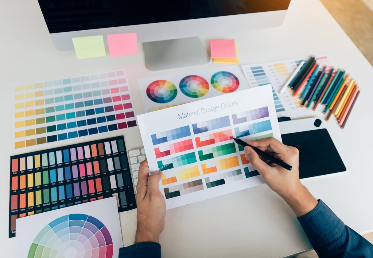
Too many colors create visual chaos. Choose a primary brand color, a secondary accent color, and a neutral background. Make sure there is strong contrast between text and background.

3. Limit Your Font Choices

Use a maximum of two fonts:

  • One for headlines (bold, eye-catching)
  • One for body text (clean, easy to read)

Avoid decorative or script fonts for body text. They are hard to read at small sizes.

4. Embrace White Space

Do not try to fill every square inch with content. White space (or negative space) gives your design room to breathe and makes the important elements stand out more.

5. Use Visual Hierarchy

Guide the reader’s eye from top to bottom using size, color, and weight. The headline should be the largest text element. The call to action should be visually distinct, perhaps inside a colored button shape or banner.

6. Add a QR Code

In 2026, QR codes are expected. Link it to your booking page, Google Maps location, menu, or a special landing page. Make sure to test the QR code before sending the file to print.

7. Include a Strong Visual Focal Point

One dominant image works better than five small ones. If you are a hotel, show your best room or pool. If you are a tour company, show the most breathtaking moment of the experience. Let one image do the talking.

How to Design a Rack Card Step by Step

Here is a practical step-by-step process you can follow, whether you are using professional design software or an online tool.

  1. Define your goal. What is the single most important action you want the reader to take? Book a tour? Visit your salon? Call for a reservation?
  2. Set up your document. Create a new file at 4″ x 9″ with 0.125″ bleed on all sides. Set resolution to 300 DPI and color mode to CMYK.
  3. Design the top third first. Place your headline, logo, and main image in the top zone. This section must work on its own.
  4. Add your core message in the middle. List your key selling points. Use bullet points or short text blocks with icons.
  5. Build your call to action at the bottom. Make it bold and obvious. Include all contact information and a QR code.
  6. Design the back. Add supporting details: service list, map, hours, testimonials, or a coupon.
  7. Review for errors. Proofread everything. Check phone numbers and URLs. Have someone else review it too.
  8. Export as a print-ready PDF. Use PDF/X-1a or PDF/X-4 format. Embed all fonts. Flatten transparency if needed.
  9. Order a proof. Before printing hundreds of copies, order a single proof to check colors, alignment, and overall feel in your hand.

Preparing Your Rack Card File for Print

Getting the design right on screen is only half the battle. Your file needs to be properly prepared for the printing press.

Print-Ready File Checklist

Requirement Details
File Format PDF (preferred), AI, PSD, or INDD
Resolution 300 DPI minimum
Color Mode CMYK (not RGB)
Bleed 0.125″ (3mm) on all sides
Safe Zone Keep text 0.25″ (6mm) from trim edge
Fonts Embedded or converted to outlines
Black Text Use 100% K only (not rich black) for small body text

Paper Stock Options

The paper you choose affects how your rack card feels in someone’s hand. Common options include:

  • 14pt cardstock: The most popular choice. Sturdy enough to stand in racks without flopping over.
  • 16pt cardstock: Premium feel. Great for luxury brands, upscale hotels, and high-end services.
  • Gloss coating: Makes colors pop. Good for image-heavy designs.
  • Matte coating: Elegant, easy to read, and fingerprint-resistant.
  • UV coating: Extra shine and protection. Ideal for rack cards that will be handled frequently.

For most small businesses, 14pt gloss cardstock offers the best balance of quality and cost.

Tools You Can Use to Design a Rack Card

You do not necessarily need to hire a designer. There are several tools available depending on your skill level and budget.

Tool Skill Level Cost Notes
Canva Beginner Free / Pro Templates available; easy drag-and-drop
Adobe InDesign Advanced Subscription Industry standard for print layout
Adobe Illustrator Advanced Subscription Great for custom graphics and vector work
Microsoft Word Beginner Included with Office Possible but limited; not ideal for print quality
Affinity Publisher Intermediate One-time purchase Affordable InDesign alternative

If you are a small business owner without design experience, starting with Canva and a pre-made rack card template is a perfectly valid approach. Just make sure to export at the highest quality settings for print.

If you want a truly custom, professional result, consider working with a graphic designer who understands print specifications.

Common Rack Card Design Mistakes to Avoid

Even well-intentioned designs can go wrong. Here are the most common mistakes we see:

  • Putting the logo at the very top in large size. Your logo matters, but the headline and value proposition should take priority. People pick up cards for what you offer, not your logo.
  • Cramming too much text. If your rack card looks like a newspaper column, no one will read it. Edit ruthlessly.
  • Using low-resolution images. This is the fastest way to look unprofessional. Always use 300 DPI images.
  • Forgetting the call to action. If you do not tell people what to do next, they will do nothing.
  • Ignoring the top third. Designing as if the full card is always visible. Remember, in a rack, only the top is showing.
  • Designing in RGB color mode. Screens use RGB, but printers use CMYK. Colors can shift dramatically if you do not convert.
  • No bleed or incorrect dimensions. This causes white borders or misaligned cuts at the printer.

Rack Card Design Examples by Industry

To give you a sense of what works, here is how different industries can approach their rack card content:

Hotel or Resort

  • Front: Stunning hero image of the property, headline about the experience, star rating, QR code to book
  • Back: Room types, amenities list, address with small map, contact info

Tour or Tourism Company

  • Front: Action photo from the tour, headline with the destination or experience name, price starting point
  • Back: Tour schedule, what is included, booking instructions, safety info

Salon or Spa

  • Front: Clean, relaxing imagery, headline promoting a signature treatment or seasonal offer
  • Back: Full service menu with prices, hours, location, booking link via QR code

Restaurant

  • Front: Mouth-watering food photo, headline about cuisine style or signature dish, address
  • Back: Sample menu highlights, happy hour details, reservation info

How Many Rack Cards Should You Print?

Printing quantities affect your per-unit cost significantly. Here is a general guideline:

Quantity Best For Estimated Cost Range
250 Testing a new design or limited event $30 to $60
500 Small business, single location $50 to $90
1,000 Multiple distribution points $70 to $130
5,000+ Large distribution network or tourism campaign $150 to $300+

Prices vary by printer, paper stock, and coating. Always request a quote from at least two or three print vendors.

Where to Distribute Your Rack Cards

A great rack card sitting in a box does nothing. Distribution is just as important as design.

Strategic placement ideas:

  • Hotel and motel front desks and lobbies
  • Visitor information centers and tourist bureaus
  • Airports and bus stations
  • Restaurants and cafes (ask if they allow partner cards)
  • Real estate offices
  • Doctor and dentist waiting rooms
  • Community centers and libraries
  • Trade shows and conventions
  • Your own reception area or checkout counter

Build relationships with complementary businesses. A surf school and a beachside restaurant can cross-promote by placing each other’s rack cards in their locations.

Frequently Asked Questions About Rack Card Design

What is the best size for a rack card?

The standard and most widely used rack card size is 4 x 9 inches (10.16 x 22.86 cm). This size fits all standard display racks and is accepted by virtually every commercial printer.

How do I make a rack card in Word?

You can create a rack card in Microsoft Word by setting a custom page size of 4″ x 9″. However, Word has limitations for print design. It does not support CMYK color mode or bleed settings natively. For better results, use Canva, Adobe InDesign, or Affinity Publisher.

What information should be on a rack card?

At minimum, include a compelling headline, a brief description of your service or offer, key benefits, a clear call to action, your contact information (phone, website, address), and a QR code. If printing double-sided, add supporting details like service lists, maps, hours, or testimonials on the back.

How do I design an effective rack card?

Focus on the top third of the card since that is the only part visible in a display rack. Use a strong headline, one dominant image, minimal text, and a clear call to action. Follow the three-zone layout system (hook, message, action) described in this guide.

Can I design a rack card for free?

Yes. Canva offers free rack card templates that you can customize with your own text, images, and branding. Other free options include online tools from print companies like Vistaprint and 123Print, which provide templates tied to their printing services.

Should I use glossy or matte paper for rack cards?

Gloss is the most popular choice because it makes colors vibrant and images sharp. Matte is better for designs that are text-heavy or aim for an upscale, understated look. Both work well on 14pt or 16pt cardstock.

How often should I update my rack card design?

Update your rack card whenever your pricing, services, contact information, or branding changes. Even if nothing changes, refreshing the design every 12 to 18 months keeps your marketing materials looking current and prevents them from becoming invisible in display racks.

Final Thoughts

Learning how to design a rack card is not complicated, but it does require attention to detail. The businesses that get the best results treat rack cards as a strategic marketing tool, not an afterthought.

Get the dimensions right. Prioritize the top third. Write benefit-driven copy. Use professional images. Include a clear call to action. And always prepare your file properly for print.

If you follow the steps and best practices in this guide, your rack card will not just sit in a display stand. It will get picked up, read, and acted on.

How to Fold a Tri-Fold Brochure Correctly: Step-by-Step Guide

How to Fold a Tri-Fold Brochure Correctly

Folding a tri-fold brochure sounds simple enough. You take a sheet of paper and fold it into three panels. But if you have ever ended up with panels that overlap awkwardly, edges that do not line up, or a brochure that refuses to sit flat, you know it is not as straightforward as it seems.

The difference between a sloppy brochure and a polished, professional one comes down to panel sizing, fold order, and technique. In this guide, we walk you through everything you need to know to fold a tri-fold brochure correctly every single time.

What Is a Tri-Fold Brochure?

A tri-fold brochure is a single sheet of paper (typically 8.5 x 11 inches or A4) that is folded twice to create six panels: three on the front and three on the back. It is one of the most popular formats for marketing materials, restaurant menus, event programs, and informational handouts.

There are two common tri-fold styles:

  • Letter fold (barrel fold / roll fold) – The most common type. One panel folds inward, then the other panel folds over it. The brochure “rolls” closed.
  • Z-fold (accordion fold) – The panels fold in opposite directions, creating a zigzag shape like the letter Z.

This guide focuses primarily on the letter fold, since it is the standard format most people mean when they say “tri-fold brochure.”

Why Panel Sizing Matters (They Are NOT All Equal)

This is the single most important thing to understand, and it is the mistake that causes the majority of misaligned folds:

The three panels of a letter-fold tri-fold brochure are not all the same width.

The panel that folds inward first (the inside flap) must be slightly narrower than the other two panels. If all three panels are the same size, the inner flap will stick out past the edge or cause the brochure to bulge and not close flat.

Standard Panel Sizes for Common Paper Formats

Paper Size Left Panel (Cover Flap) Center Panel Right Panel (Inside Flap)
8.5 x 11 in (US Letter) 3 11/16 in (3.6875″) 3 11/16 in (3.6875″) 3 5/8 in (3.625″)
A4 (210 x 297 mm) 100 mm 100 mm 97 mm

The difference is small (about 1/16 of an inch or 2-3 mm), but it makes all the difference. That slightly narrower inside flap is what allows the brochure to nest properly and close cleanly without any edges poking out.

Step-by-Step: How to Fold a Tri-Fold Brochure Correctly

Follow these steps for a clean, professional letter-fold brochure.

Step 1: Place the Paper Landscape on a Flat Surface

Lay your printed brochure sheet on a clean, flat surface with the inside content facing up (the side that will be visible when the brochure is opened). The paper should be in landscape orientation (wider than it is tall).

Step 2: Identify Your Three Panels

Looking at the inside of your brochure from left to right, you should have:

  1. Left panel – This becomes the back of the cover flap when folded.
  2. Center panel – This is the main interior spread that readers see when they open the brochure.
  3. Right panel (inside flap) – This is the narrower panel that folds in first and is hidden inside.

Step 3: Fold the Right Panel Inward First

Take the right panel (the slightly narrower one) and fold it to the left, toward the center of the sheet. Align the fold carefully. The edge of this panel should fall just short of the left edge of the paper because it is narrower.

Tip: Do not crease immediately. Position the fold, check alignment, and only then press down to crease.

Step 4: Fold the Left Panel Over the Top

Now take the left panel and fold it to the right, over the top of the already-folded right panel. The left edge of this panel becomes the front cover of your brochure.

The left panel should align neatly with the right edge of the brochure. Because the inside flap is slightly narrower, everything nests together without overlapping edges.

Step 5: Crease Firmly

Use a bone folder, the back of a spoon, or a ruler edge to press the folds flat and crisp. Run the tool along each fold line from top to bottom with firm, even pressure.

Summary of Fold Order

Step Action Result
1 Fold the right panel inward (to the left) Inside flap is tucked in
2 Fold the left panel over the top (to the right) Front cover faces outward, brochure is closed

Understanding Panel Order and Content Placement

Knowing where each panel ends up after folding is critical for placing your content correctly. Here is how the six panels map out:

Outside of the Sheet (Face Down Before Folding)

Left Center Right
Inside flap (visible when brochure first opens) Back cover Front cover

Inside of the Sheet (Face Up Before Folding)

Left Center Right (Narrower)
Interior panel (left) Interior panel (center) Inside flap back (hidden panel)

This panel order is easy to get confused, which is why many designers print a test sheet and fold it by hand before sending a full job to print.

Common Mistakes That Cause Misaligned Folds

Even experienced designers and office workers run into these issues. Here is what to watch out for:

1. Making All Three Panels the Same Width

As we covered above, the inside flap must be slightly narrower. If you divide your sheet into three perfectly equal sections, the inside panel will stick out past the cover edge, and the brochure will not close cleanly.

2. Folding the Wrong Panel First

Always fold the inside flap (right panel) first, then fold the cover flap (left panel) over the top. Reversing this order puts the wrong content on the outside and creates a brochure that opens backwards.

3. Not Using a Scoring Line

For heavier paper stocks (anything above 80 gsm / 60 lb text), folding without scoring first can cause the paper to crack or fold unevenly. A scoring tool or bone folder pressed along the intended fold line before you fold makes a massive difference.

4. Folding on an Uneven Surface

Folding on a cluttered desk, a soft surface, or with debris under the paper leads to wrinkles and uneven creases. Always use a hard, flat, clean surface.

5. Rushing the Crease

Pressing the fold down before the paper is properly aligned is a recipe for a crooked brochure. Take an extra second to line up the edges before you commit to the crease.

6. Ignoring Grain Direction

Paper has a grain direction. Folding with the grain (parallel to the grain) produces smoother, cleaner folds. Folding against the grain can cause cracking, especially on coated or heavy stock. If you are ordering paper specifically for brochures, ask for grain long (the grain runs parallel to the 11-inch side on US Letter).

Tips for Achieving Clean, Professional Folds

Whether you are folding a batch of 50 brochures for a meeting or proofing a single copy before a print run, these tips will elevate your results:

  • Use a bone folder. This inexpensive tool (available at any craft store) creates sharp, crisp creases without damaging the paper.
  • Score before folding. Use a scoring stylus or the blunt edge of a butter knife against a ruler to create an indent along the fold line. This guides the paper into a clean fold.
  • Mark your fold lines lightly with pencil. If you are folding plain paper without printed guides, measure and mark both the top and bottom edges, then use a ruler to connect them before folding.
  • Print crop marks or fold guides. Most design software (InDesign, Canva, Microsoft Word) allows you to add fold guides to your layout. Use them.
  • Test with a dummy sheet first. Before printing on expensive paper, fold a plain sheet to verify your layout, panel order, and content placement.
  • Fold in small batches. If you are folding many brochures by hand, do them in small groups rather than trying to rush through a large stack.
  • Consider professional folding. For runs of 100 or more, a print shop with a mechanical folder will deliver consistent, precise results far faster than hand folding.

Letter Fold vs. Z-Fold: Which Should You Use?

While the letter fold is the default for most tri-fold brochures, the Z-fold has its own advantages. Here is a quick comparison:

Feature Letter Fold (Roll Fold) Z-Fold (Accordion Fold)
Panel sizes Inside flap is narrower All three panels can be equal
Reader experience Opens in stages, reveals content gradually Opens fully in one motion
Best for Storytelling, sequential content, menus Maps, timelines, wide images or charts
Fits in #10 envelope Yes Yes
Fold direction Both folds go the same direction Folds go in opposite directions

For most standard brochure applications, the letter fold is the way to go. The Z-fold is better when you want readers to see all interior panels at once.

How to Fold a Tri-Fold Brochure in Microsoft Word

If you are creating your brochure in Word, here is how to set up the layout correctly:

  1. Set your page orientation to Landscape (Layout > Orientation > Landscape).
  2. Set your margins to 0.5 inches on all sides (or narrow margins).
  3. Insert a table with 3 columns and 1 row to create your panel guides.
  4. Make the right column slightly narrower (about 1/16 inch or 2 mm less) than the other two columns.
  5. Design your content within each cell, keeping important text and images away from the fold lines.
  6. Print a test page, fold it, and verify everything lines up before doing your final print.

Pro tip: Set the table borders to “No Border” before your final print so the guide lines do not appear on the finished brochure.

Quick Reference: Tri-Fold Brochure Folding Checklist

Use this checklist every time you fold a tri-fold brochure:

  • Paper is on a flat, clean, hard surface
  • Paper is in landscape orientation
  • Inside flap (right panel) is slightly narrower than the other panels
  • Right panel is folded inward first
  • Left panel is folded over the top second
  • Edges are aligned before creasing
  • Folds are creased firmly with a bone folder or similar tool
  • Finished brochure lies flat with no edges sticking out

Frequently Asked Questions

How do you fold a trifold brochure perfectly?

To fold a trifold brochure perfectly, make sure the inside flap panel is about 1/16 inch (2 mm) narrower than the other two panels. Fold that narrower panel inward first, then fold the opposite panel over the top. Use a bone folder to create crisp, clean creases, and always work on a flat, hard surface.

Do you flip a trifold brochure on the long or short edge?

When printing a double-sided tri-fold brochure, you should flip on the long edge (also called “flip on long side” in your printer settings). This ensures the back side of the sheet aligns correctly with the front when folded. Flipping on the short edge will cause the back content to appear upside down.

What does a tri-fold brochure look like?

A tri-fold brochure looks like a single sheet of paper folded into three connected panels, similar in size to a standard business envelope. When closed, you see the front cover. When you open the first flap, you reveal an interior panel. When fully opened, all three interior panels are visible side by side.

How do you perfectly trifold a piece of paper?

For a quick method without measuring: take the right side of the paper and bring it toward the left until it looks like roughly one-third of the sheet. Adjust until the folded edge falls about one-third of the way across. Then fold the left side over the top. For precision, measure and mark the fold lines at the top and bottom edges using a ruler before folding.

What is the correct panel size for a tri-fold brochure on US Letter paper?

For a standard 8.5 x 11 inch sheet, the two outer panels should each be 3 11/16 inches (3.6875″) wide, and the inside flap panel should be 3 5/8 inches (3.625″) wide. This slight difference allows the inner panel to nest inside without sticking out.

Can I fold a tri-fold brochure on A4 paper?

Yes. For A4 paper (210 x 297 mm), use two panels at 100 mm wide and the inside flap panel at 97 mm wide. The same folding principles apply regardless of paper size.

web design

Top 10 UI Design Principles for Creating Intuitive Digital Experiences

Creating intuitive digital experiences is essential for any modern website or application. User Interface (UI) design plays a pivotal role in shaping how users interact with a product, and it can be the difference between someone sticking around or abandoning the platform. A well-designed interface not only looks great but also feels natural to navigate. If users can accomplish tasks quickly and without confusion, they’re more likely to stay engaged.

To ensure your digital experiences are seamless, here are the top 10 UI design principles to guide you in creating interfaces that are both user-friendly and visually appealing.

1. Focus on User-Centered Design

User-centered design means putting the needs, expectations, and goals of the users at the heart of the design process. When designing a UI, always start by understanding who your users are, what they want, and how they interact with technology. Conduct user research to gain insights into their preferences and pain points, then design the interface to align with their mental models. If users feel that the UI was designed with their needs in mind, they’re more likely to enjoy using it.

2. Maintain Consistency

Consistency is key when creating a coherent and intuitive user interface. Design elements such as buttons, fonts, colors, and layout should be uniform across the entire platform. This ensures that users won’t have to re-learn how to navigate different sections of the site or app. Maintaining consistency builds trust with users and makes the experience more seamless. Follow established design patterns, especially for common actions, so that users recognize them instantly.

3. Use Clear and Simple Navigation

Good navigation is the backbone of any intuitive UI. Users should always know where they are and how to get to where they want to go. Simple, predictable navigation structures reduce cognitive load and help users move through the interface with ease. Use clear labels for navigation items, and don’t overwhelm users with too many options. Breadcrumbs, tabs, and a well-organized menu structure can greatly enhance the user’s journey.

4. Prioritize Visual Hierarchy

Visual hierarchy refers to the arrangement of UI elements in a way that guides users through the content in a natural order of importance. The most critical information should be placed at the top or given more prominence through larger fonts, bold colors, or positioning. By carefully designing the hierarchy, you help users quickly find what they’re looking for. For example, primary actions like “Buy Now” or “Sign Up” should stand out, while less important details can be de-emphasized.

5. Ensure Responsiveness and Flexibility

Users access digital products on a variety of devices, from smartphones to tablets to desktops. Your UI should be designed to adapt seamlessly to any screen size. Responsive design ensures that the user experience remains consistent and functional regardless of the device being used. Flexible layouts and scalable components help make sure that your design elements don’t break or become unusable on smaller screens. Test your interface on different devices to ensure optimal performance.

6. Minimize User Effort

One of the hallmarks of an intuitive UI is that it minimizes the effort required from users to achieve their goals. Reduce the number of clicks, swipes, or keystrokes needed to complete tasks. Where possible, use autofill, predictive search, or shortcuts to make the user’s experience smoother. The less work users have to do, the more enjoyable their experience will be. Keep forms short, reduce unnecessary steps, and simplify complex interactions.

7. Provide Immediate Feedback

When users interact with your interface, they need immediate feedback to confirm that their actions were successful. Whether it’s a button press, form submission, or menu selection, feedback reassures users that the system is responding to their input. This feedback could be visual (such as a button changing color), auditory (a click sound), or through text (such as a success message). Lack of feedback can leave users confused and unsure if their actions were recognized.

8. Follow the Principle of Least Surprise

The principle of least surprise states that users should never be surprised by how the UI behaves. They should be able to predict what will happen when they perform an action. For example, a link should look clickable, and clicking it should take the user to the expected destination. Misleading design choices can lead to frustration. Make sure that buttons, icons, and other interactive elements behave in predictable and logical ways, following common web standards.

9. Design for Accessibility

Accessibility should be a priority, not an afterthought. Design your UI so that it can be easily used by people with disabilities. This includes making sure that text is legible, color contrast is sufficient, and that the interface is navigable using a keyboard or screen reader. Accessible design improves the experience for all users, not just those with disabilities. Features like scalable text, captions for multimedia, and alternative text for images all contribute to a more inclusive UI.

10. Test and Iterate

No design is perfect right out of the gate. Testing is an essential step in creating an intuitive UI. Conduct usability tests with real users to observe how they interact with the interface and identify potential pain points. Use A/B testing to compare different design options and see what works best. Gather feedback and use it to iterate and refine the design. Continuous improvement ensures that the UI evolves to meet users’ changing needs and expectations.

By applying these ten UI design principles, you’ll be well on your way to creating digital experiences that are intuitive, engaging, and user-friendly. Always keep the user at the center of the design process, prioritize clarity and consistency, and remember that testing and iteration are vital for long-term success.

A well-designed interface not only improves usability but also enhances the overall perception of your product, leading to increased engagement, satisfaction, and loyalty from users. Follow these principles, and you’ll create an experience that feels natural and enjoyable for your audience.

web design

10 Unconventional UI Design Elements That Enhance User Experience

Diving into the realm of user interface (UI) design reveals a landscape teeming with innovation and creativity. While traditional elements play it safe, there’s a world of unconventional UI design choices that dare to break the mold, enhancing user experience (UX) in unexpected ways. These creative outliers not only capture users’ attention but also make interactions more engaging, memorable, and enjoyable. Here are ten unconventional UI design elements that are setting new standards in user experience.

1. Microinteractions with Delightful Feedback

Microinteractions are small, often overlooked elements that, when designed unconventionally, can significantly enhance UX. Think beyond the loading spinner to animations that respond to user actions with delightful feedback, like a button that blooms into a flower upon clicking. These playful interactions add a layer of engagement and personality to your design.

2. Voice-Activated Interfaces

As voice command technology becomes more refined, integrating voice-activated elements into UI design offers a hands-free, futuristic way to navigate. These interfaces can make digital experiences more accessible and convenient, particularly for users with physical disabilities or those multitasking.

3. Augmented Reality (AR) Integrations

Augmented reality has transcended its novelty status, becoming a groundbreaking tool in UI design. AR can overlay digital information onto the real world, offering interactive and immersive experiences that extend beyond the screen. From virtual try-ons to interactive maps, AR integration opens up a world of possibilities for user engagement.

4. Cinematic Full-Screen Video Backgrounds

While not entirely new, the use of high-quality, cinematic video as a full-screen background remains an unconventional choice for UI design. These captivating visuals can tell a story and set the mood instantly, providing a rich, immersive experience before a user even scrolls.

5. Dynamic Typography

Dynamic typography, which evolves and animates based on user interaction or scrolling, offers a fresh way to engage users. This can range from changing font sizes and colors to more complex animations that react to user behavior, making the textual content an interactive element of the design.

6. Interactive Storytelling

Borrowing from the world of gaming, interactive storytelling within UI design allows users to become part of the narrative. By making choices or completing tasks, users can unlock different paths or outcomes, turning a visit to a website or app into a unique, personal journey.

7. Non-Linear Navigation

Breaking away from the traditional top-down or left-right navigation, non-linear navigation systems encourage exploration and discovery. This might involve radial menus, scattered points that reveal content on hover, or a completely free-form layout that encourages users to navigate in a way that feels natural to them.

8. Psychological Triggers

Implementing elements designed to trigger psychological responses, such as using color and imagery to evoke emotions or incorporating gamification to boost engagement, is a nuanced approach that can significantly impact user behavior and satisfaction.

9. Dark Mode and Beyond

While dark mode has gained popularity for its aesthetic appeal and reduced eye strain, pushing this concept further with themes that users can customize according to their mood or the time of day introduces a new level of personalization in UI design.

10. 3D Elements and Immersive Environments

Incorporating 3D elements and creating immersive environments within a UI can transport users into a different space or reality. Whether it’s a subtle parallax effect or a full-blown 3D world, these elements add depth and dimension to the digital experience.

These unconventional UI design elements showcase the limitless possibilities for enhancing user experience. By stepping outside the conventional boundaries and experimenting with these innovative ideas, designers can create memorable, engaging digital experiences that resonate with users on a deeper level.

As the digital landscape continues to evolve, embracing unconventional UI design becomes not just an opportunity for differentiation but a necessity for staying ahead. These creative design choices not only improve usability and accessibility but also inject a dose of personality and innovation into the user experience. In the journey to create interfaces that truly stand out, daring to be unconventional might just be the most conventional wisdom of all.

UI Design

10 Tips For Better UI

Web UI is one of the most crucial aspects of a successful website. It’s not easy creating a UI that’s both helpful to your visitors and beautifully designed at the same time. As a web developer, creating a good UI is one of the first challenges you’ll ever face.

That said, here are a few important tips to keep in mind.

1. Keep it simple

When it comes to web UI, less is definitely more. Keep your designs clean and uncluttered, and only include the elements that are absolutely necessary. Remember that users will be accessing your site from a variety of devices, so it’s important to ensure that your content is easy to read and navigate on all screen sizes.

2. Make it visually appealing

First impressions count, so make sure your site looks great! Use high-quality images and videos, and choose a color scheme that is pleasing to the eye. Pay attention to the small details, as they can make a big difference in the overall look and feel of your site.

3. Be consistent

Consistency is key when it comes to web UI. Use the same fonts, colors, and layouts throughout your site to create a cohesive and professional look. This will help users feel comfortable and confident navigating your site, and make it easy for them to find the information they’re looking for.

4. Use whitespace wisely

Whitespace doesn’t have to be boring! Use it to your advantage by using it to highlight important content or break up long blocks of text. Just be sure not to overdo it, as too much whitespace can make a site look unfinished.

5. Make use of typography

Typography is an important element of web UI, so it’s important to choose fonts that are easy to read and look good on all devices. Stick to a limited number of fonts, and use headings and subheadings to break up your content and make it easy to scan.

6. Use icons and visuals

Icons and visuals are a great way to add interest to your site and make complex concepts easier to understand. When used sparingly, they can help guide users through your content and make your site more engaging.

7. Optimize for search engines

Make sure your site is optimized for search engines by including relevant keywords in your content and using descriptive titles and Meta descriptions. This will help users find your site more easily, and ensure that you’re getting the most traffic possible.

8. Make it mobile-friendly

With more and more people accessing the internet from their mobile devices, it’s important to make sure your site is responsive and looks great on all screen sizes. Use a mobile-first design approach, and test your site on multiple devices to ensure that it’s easy to use and navigate.

9. Add interactivity

Interactive elements are a great way to add interest to your site and engage users. Include features such as polls, quizzes, and games to encourage users to stay on your site longer. Just be sure not to overdo it, as too much interactivity can be overwhelming.

10. Test, test, test!

Last but not least, don’t forget to test your site before you launch it. Check for broken links, misspellings, and other errors that could turn users away. Use analytics to track user engagement and see how people are using your site. And most importantly, get feedback from real users to see what works and what doesn’t.

By following these tips, you can create a web UI that is both effective and engaging. Just remember to keep it simple, be consistent, and make use of whitespace. And don’t forget to test your site before you launch it!

website

How To Create A Responsive Website In 10 Steps?

What Is The Aim Of Any Responsive Website? Merely purchasing a domain and publishing a website is not expected in today’s competitive world.

The main aim of a responsive website is:

  • To engage the visitors with superior images and text;
  • Retain them to surf for more information;
  • Compel them to take a call to action as per your desire.

Furthermore, a responsive website should work well irrespective of the viewport. It should be uniformly & flawlessly responsive across all the devices used – from small, medium, and big screens.

How To Create A Responsive Website In 10 Steps? Here We Have Shortlisted 10 Essential Points That Will Help You To Design The Better Version Of Your Website:

1. Your Responsive Website Should Be Friendly With All Types Of Viewports:

Yes, your website should be responsive across all the available devices and screen sizes. Studies have shown that around 70% of web traffic is created over mobile phones. Even Google Ranking gives additional points to responsive websites.

Remember, your website loading time is directly proportional to the visitors’ frustration level. The more loading time means more frustration level leading to an increased bounce rate.

2. Easy & Uncomplicated Layouts:

The studies prove that the attention span of human beings is comparatively less. And, in case your website layout is full of clutter, you will encounter a high bounce rate. Hence, the first step is to have an easy and uncomplicated website layout.

Beforehand you should choose a design that will be attractive on the desktop & other devices like laptops, mobile phones, tablets, phablet, etc.

3. Make Sure Of Easy Navigation:

The exact meaning of Easy Navigation is – your visitors should not get confused while surfing on your website. Whatever they are looking for should be available without much navigation. Hence, it is required that you keep your website layout simple. Let the visitors get a homely experience while searching for the product they are looking for!

4. Use White Spaces:

It is not required to decorate all the pixels on your webpage with random colors.

Make skillful use of white spaces on the webpage. Remember, a clean white space will keep the visitors engaged as it enhances readability and diminishes unwarranted cluttered perception. But, you should use white spaces very proficiently and know what corner or center page demands the white space.

5. Make Use Of Structured Text:

It is advised to keep less text on your webpage. This means using limited text and making sure the message is fully delivered. One paragraph should not be more than 3 to 4 sentences.

What if your product demands higher text lengths? In such a case, divide the lengthy texts into various sections with appropriate subheadings.

In short, your website text should be easy to read. Remember to use lucid language. The writing should be in a Friendly Tone!

6. Make Use Of Adequate Multimedia:

Studies have shown that users are more likely to recollect the image seen on your website than the text they have read. Hence, use adequate images, infographics, and videos wherever possible. Replace your text with HD-quality images and videos.

Make a perfect balance between the text and the images used, which will not look like clutter but assures a long-lasting impression.

7. Make Use Of Eye-Soothing & Attractive Color Blend:

The visitors will be dejected from seeing lots of jazzy illumination on your webpage. Without considering correct color mixing, visitors will be compelled to leave your webpage.

It is advised to use two base colors blended with an additional accent color. Also, make use of those colors that are used in creating your corporate logo. This acts as an easy reminder media and helps establish brand consistency amongst the visitors.

8. Make Use Of Fonts That Are Eye-Appealing:

Using any type of font or text size on the website is not recommended. Readability Score is important for your websites. Try to know the scientific reason behind different fonts, sizes, and readability!

Assume that you are on a webpage of another website and struggling to read the webpage. You had to strain your eyes to read the information additionally. What will be your reaction? With lots of frustration, you will leave the website.

Hence, make use of eye-appealing fonts. Remember, these fonts should be compatible & matching any viewport.

9. Organize Properly – Call To Action & Buy Now Button:

If you want that the visitors should subscribe to your weekly newsletter, or get a helpful tip every week offer them a Call to Action (CTA). But place the CTA button wherein they do not have to search for it.

Furthermore, if the visitor decided to buy the product then the ‘Buy Now’ button should be within their hindsight.

 10. Remove Non-Required Or Obsolete Information & Images:

An uncluttered and easy-to-use website is the need of the day. Periodically rework all the contents and images, which are redundant and do not suffice the purpose. If the posted information is not read or not advantageous for the visitors it is better to replace it with something meaningful.

Do not hesitate to remove or replace any image or graphic that consumes more time to load the website. Your website content should be interesting, and not time-consuming for visitors.

Conclusion:

After a deep study, we have concluded to answer the question – How To Create A Responsive Website In 10 Steps – in the most simplified manner.

If you adhere to the points mentioned above, your website will surely get high retention. It is not just to create a website or responsive website, but it is creating a website to achieve the company goals.

You can commence with one point at a time, refine it, and proceed to the next point.

You can either do it yourself or hire a professional without hesitation.

Remember, When You Are Hiring A Professional Website Developer, You Are Investing And Not Spending!

website

Tips For Your First DIY Website

Launching your website is more accessible thanks to web builders online. Of course, there’s a difference between launching a website and one that gets the job done.

We understand that not everyone would want to avail of web development services at first as it’s expensive. If you want to DIY your website, then consider these tips first.

1. Draw Your Plans First

This sounds a bit counterproductive since you’re building a digital platform. However, creating a visual guide on what you want to achieve is a good idea.

Grab a piece of paper and try to draw a rough plan of your dream website. You should also create a flow chart of how the pages should flow. This should include your page’s menus, categories, and other crucial elements.

This is a good start for any newbie web developer. Once you have a guide, you can easily have a plan to follow. If you want to, you can also check out a few samples here at Web Design-Inspiration.

2. Know Your Audience

Who are you trying to reach out to anyway?

Get to know your audience better. Some critical factors to consider include gender, age, browsing habits, and more. Building a website for the right people means knowing who those people are deeply first.

Take this as an opportunity to begin establishing the branding you want your website to have.

3. Use A Platform For Beginners

There are lots of website builders out there. Not all of them are great for beginners, though. A beginner’s platform should have intuitive menus, many customization options, and excellent customer support. That said, here are a few outlets to try out.

  • WordPress – one of the biggest web development platforms around. WordPress is known for its intuitiveness and affordable plans. You also access hundreds of themes and plugins that make web development easier.
  • Wix – this platform provides you with over 500 templates that are very easy to customize. In terms of design, you shouldn’t have any worries with Wix. It also has an AI system that automatically creates a website depending on your needs.
  • GoDaddy – while it caters to all website types, GoDaddy is best preferred by businesses. It features loads of apps that will let you create a digital store easily. It also features an AI system that makes a website for you.

4. Don’t Complicate Things

There’s nothing wrong with dreaming big for your website. However, if you aren’t experienced enough in web development, you might end up overcomplicating things on your end.

Don’t worry about creating a simple and minimalist website. The truth is that people love websites like these.

There’s less clutter for them to go through. It simplifies the user experience on your website and allows them to get what they want without any problems or struggles.

5. Choose Performance Over Style

Adding things like photos, videos, animations, and more fancy design elements to your website can be tempting.

Instead of going for the stylish options, go for things that affect performance. Trust us when we say that people prefer a website that loads fast over one that looks great.

Creating a website on your own might seem impossible at first. However, there are lots of solutions and platforms that make the job easier on your end.

6. Test!

Testing is a crucial part of running a website. You can do it on your own too.

Open your website on various browsers and check if it loads fast enough. Aside from that, ensure all elements and pages are loading correctly too. After all, you want to provide a good user experience for your website’s visitors.

Doing this will allow you to adjust and change your website accordingly.

Reading through these tips and understanding the core of web development is key in creating the perfect online platform for your business, hobby, or personal needs.

Eventually, you’ll realize that there’s only so much you can do without experience. If you want the best website possible, you should also consider investing in web development services.

divi

Get Some of the Best Divi Coupon Discounts

The Divi is the newest coffee maker from the manufacturer of Kenmore and other home appliances. This coffee maker is easy to use and comes with a range of functions that include auto espresso machine, automatic drip coffee maker and a timer feature. This article is going to focus on Divi Coupon Discounts so you can buy your Divi at a discount.

The Divi is the most affordable home appliance in the world. In the last few years it has become more popular with consumers due to its ease of use, convenience, low-cost, and excellent quality. Many companies have tried to duplicate this product but only one has managed to successfully launch it successfully into the market place.

Best Divi Coupons ? Really

One way that the Divis has stood out from the competition is by offering several different products at discount prices. A regular Divi can be used for making espresso, coffee, cappuccino, latte, frappes, and many other types of beverages. You can get these Divis at retail stores for a lot less than the regular retail price and that’s one of the reasons why they are so popular.

Another reason why so many people like this product is because it is extremely easy to use and operate. The automatic espresso machine, automatic drip coffee maker and the timer feature are all quite user friendly. This means that there is no guess work involved when it comes to brewing a good cup of coffee.

All of the products are reasonably priced, which makes it even more affordable. You can use the Divis for several different types of things without spending too much money. You can use the coffee maker to make one cup of coffee then go back and make another cup before the first one is finished.

When it comes to buying any of these products online, there are a number of places where you can get some of the best Divi Coupon Discounts. Most of these online vendors will offer up their products for sale for less money than the regular price. The reason they are being offered at such a discounted price is because the product is such a big hit in the market place.

Another good reason to try Divi for WordPress

There are also many other perks and features associated with these Divi Coupon Discounts. Some of them have free shipping with orders over $25 and you will also receive a free coffee filter. when you purchase a Divi for a discounted price under fifty dollars.

If you want to learn more about Divis then visit the official website or blog of the manufacturer. It has a wealth of information on the Divis including reviews, ratings, features, specifications and much more. You can also find out more about Divi Coupon Discounts from forums, blogs, magazines and newspapers.

The Divis coupons can be purchased through the internet with ease. The great thing about shopping online is that you can look for the best deal possible and that includes these amazing Divis Coupon Discounts.

If you do not have much time to read product descriptions and reviews then you can go to any search engine and type in a search for the phrase “divis coupon discounts”. You will then come up with a wealth of results that include all kinds of sites that are selling these discounts. Just take a minute to check each site out and see if you like what you see. The key to finding a coupon that works for you is to shop around and take your time.

best wordpress discount

Once you find a Divi coupon that works for you then you will need to input your information. Once you enter the discount code you will see that a discount will appear on your screen.

So where can you find the best coupon ?

The key to maximizing the benefits of the code is to make sure that you enter the correct code.

The better your coupon is the better the discount will be.