

Mobile-First Design Principles: What Every Business Owner Should Understand Before Building a Website
If you are planning a new website in 2026, you have probably heard your designer or agency mention mobile-first design principles. It sounds technical, but the idea is actually simple, and understanding it can save you money, improve your Google rankings, and increase the number of visitors who turn into customers.
This guide is written for entrepreneurs and decision-makers, not developers. No jargon, no fluff. Just a clear explanation of what mobile-first means today, why it matters for your business, and what you should expect from a designer who follows this approach.

What Mobile-First Design Actually Means
Mobile-first design is a strategy where a website is designed for the smallest screen first (a smartphone), and then progressively expanded for tablets, laptops, and large desktop monitors.
It is the opposite of the old way of working. For years, designers built beautiful desktop sites and then squeezed them down to fit a phone. The result was often slow, cluttered, and frustrating to use on mobile. Mobile-first flips that process. The phone version is the foundation, and everything else is an enhancement.
In practical terms, this means your designer will start by asking:
- What is the single most important message a visitor must see on a phone?
- What action do you want them to take (call, book, buy, subscribe)?
- What content can be removed, simplified, or hidden behind a tap?
Why Mobile-First Matters More Than Ever in 2026
Mobile traffic now accounts for the majority of visits on most business websites. Google has been using mobile-first indexing for years, meaning it looks at the mobile version of your site to decide how you rank. If your mobile experience is poor, your search visibility suffers, no matter how nice your desktop version looks.
Here is what is at stake:
- SEO rankings: Google rewards fast, well-structured mobile sites.
- Conversions: A clean mobile experience leads to more form submissions, calls, and sales.
- Brand perception: A clunky phone site makes your business look outdated.
- Accessibility: Mobile-first sites tend to be easier to use for everyone, including older visitors and people with disabilities.
The Core Mobile-First Design Principles in 2026
Below are the principles your designer should be applying. You do not need to implement them yourself, but knowing them helps you ask the right questions and approve the right work.
1. Content First
Before any visual design happens, the content is prioritized. What matters most goes at the top. Secondary information moves down or gets removed entirely. On a phone screen, every pixel counts.
2. Progressive Enhancement
Start simple, then add features for bigger screens. A small phone gets the essentials. A desktop might get extra animations, larger images, or multi-column layouts. This keeps mobile fast without sacrificing richness on desktop.
3. Touch-Friendly Interfaces
Buttons must be large enough to tap with a thumb. Links should not be crammed together. Forms should be short and easy to fill out on a small keyboard.
4. Speed and Performance
Mobile users are often on cellular connections. Heavy images, oversized fonts, and unnecessary scripts kill performance. A mobile-first site is lean by design.
5. Simple, Clear Navigation
Menus must be obvious and easy to use with one hand. Hamburger menus, sticky call buttons, and clear back paths are standard in 2026.
6. Visual Hierarchy
Typography, spacing, and contrast guide the eye. A user should know within two seconds what your business does and what to do next.
Mobile-First vs Responsive Design: Are They the Same?
Not quite. People often confuse the two. Here is a quick comparison:
| Aspect | Responsive Design | Mobile-First Design |
|---|---|---|
| Starting point | Often desktop | Smartphone |
| Approach | Shrink down | Scale up |
| Performance on mobile | Variable | Optimized by default |
| SEO impact | Good if done well | Strong by design |
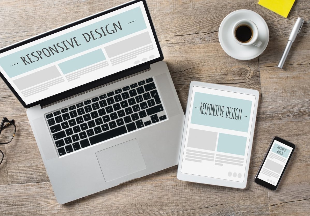
Mobile-first is a philosophy. Responsive is a technique. The best modern websites use both.
How Mobile-First Changes the Website Build Process
When you hire a designer who works mobile-first, the project flow looks different. Here is what to expect, step by step:
- Content audit: Together you decide what is essential.
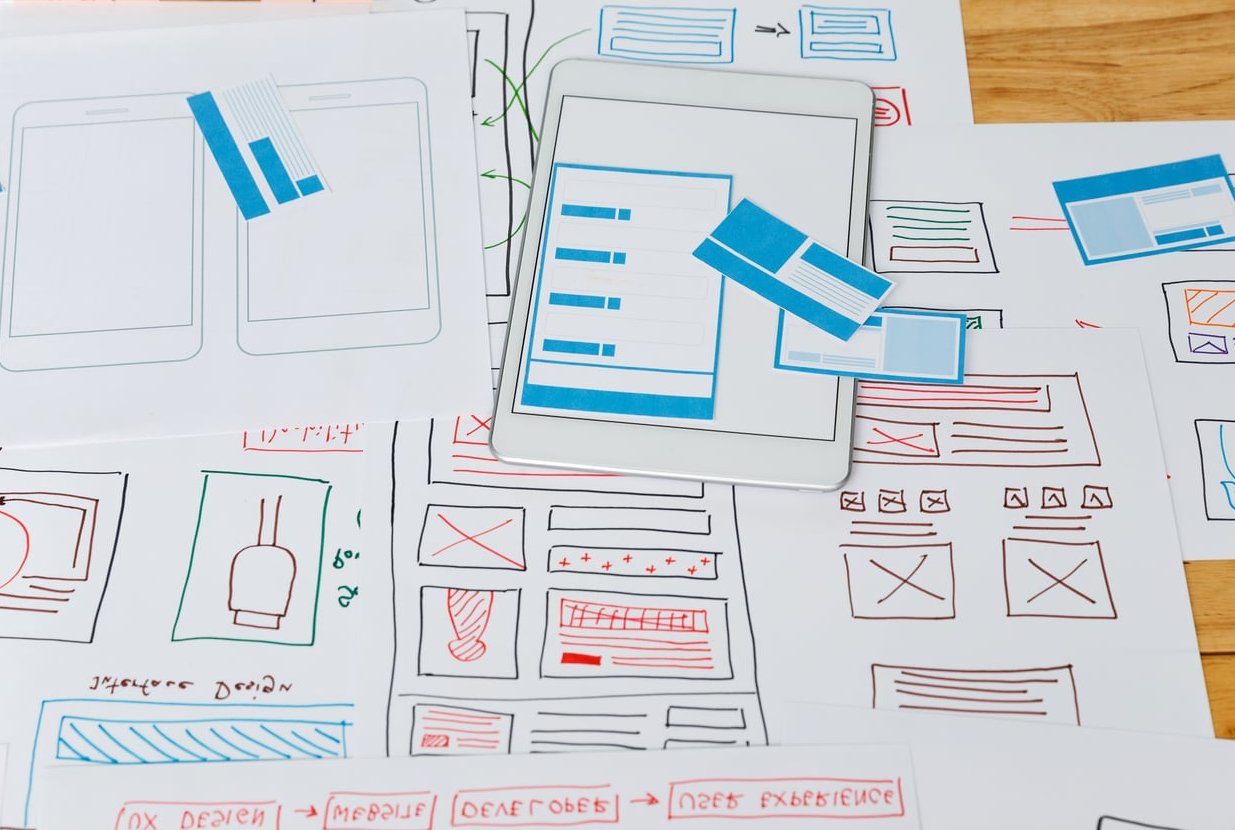
- Mobile wireframes first: You will be shown phone layouts before desktop ones.
- Progressive design layers: Tablet and desktop versions are added on top.
- Performance testing: Speed and Core Web Vitals are checked on real phones.
- Conversion review: Every key action is tested with a thumb, not a mouse.
If your designer skips the mobile wireframes and jumps straight to a desktop mockup, that is a red flag in 2026.
Questions to Ask Your Designer Before You Sign
- Will you design the mobile version first?
- What page speed score are you targeting on mobile?
- How will you handle navigation on small screens?
- Can I see real mobile prototypes before the desktop version is built?
- How will the site perform on a slow 4G connection?
These five questions alone will tell you whether the person you are about to hire understands modern web design.
Common Mistakes to Avoid
- Approving a desktop mockup without seeing the mobile version: You will regret it later.
- Insisting on too much content above the fold: It works on desktop but kills mobile.
- Using heavy hero videos: They slow down phones and drain batteries.
- Ignoring tap targets: Small buttons frustrate visitors and reduce conversions.
- Forgetting the thumb zone: Important actions should be reachable with one hand.
The Bottom Line for Business Owners
Mobile-first design is no longer a trend, it is the standard. In 2026, building a website any other way means leaving customers and rankings on the table. The good news is that you do not need to be a designer to benefit from this approach. You just need to understand the principles, ask the right questions, and work with a team that puts your mobile visitors first.
At Peter Avey, every website project starts on a phone screen. Because that is where your customers already are.
FAQ: Mobile-First Design Principles
What is the main principle of mobile-first design?
The main principle is to design for the smallest screen first and then progressively enhance the layout for larger devices. This forces clarity, speed, and focus from the start.
Is mobile-first design better for SEO?
Yes. Google uses mobile-first indexing, meaning it primarily looks at the mobile version of your site when ranking. A well-built mobile-first site has a clear SEO advantage.
Do I still need a desktop version of my website?
Absolutely. Mobile-first does not mean mobile-only. The desktop experience is built on top of the mobile foundation, often with richer visuals and more detailed layouts.
Will mobile-first design cost more?
Not usually. It can actually save money in the long run because the site is leaner, faster, and easier to maintain. It also reduces the risk of expensive redesigns later.
How long does it take to build a mobile-first website?
Most small business sites take between four and ten weeks, depending on the number of pages, custom features, and content readiness. Mobile-first does not slow the process down, it focuses it.
Can I convert my existing website to mobile-first?
Sometimes yes, but often a fresh rebuild is more efficient. A proper audit will reveal whether your current structure can be adapted or whether starting over delivers better long-term results.