
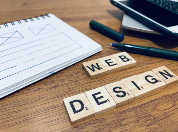
What Is Visual Hierarchy in Web Design?
If you have ever landed on a website and immediately knew where to look, what to read first, and where to click, you experienced good visual hierarchy at work. If you have ever landed on a site and felt confused, overwhelmed, or unsure what to do next, that was the result of poor visual hierarchy.
Visual hierarchy in web design is the principle of arranging elements on a page so that visitors naturally see them in the order of importance you intended. It is a system that uses size, color, contrast, spacing, and positioning to direct the eye from the most important information to the least important, step by step.
Think of it like a well-organized shop window. The biggest, brightest item in the center grabs your attention first. Supporting items sit around it to provide context. A price tag or sign tells you what to do next. Nothing competes for your attention because everything has its place.
On your business website, visual hierarchy determines whether visitors read your headline, understand your offer, and click that “Get a Quote” or “Contact Us” button. Without it, even the best content gets lost in noise.
Why Visual Hierarchy Matters for Business Websites
You might be thinking: “I’m not a designer. Why should I care about this?” The answer is simple. Visual hierarchy directly impacts two things every business owner cares about: engagement and conversions.
Visitors Decide in Seconds
Research consistently shows that people form an impression of a website within the first few seconds. Visual hierarchy ensures that during those critical seconds, visitors see your most compelling message first, not your footer links or a random stock photo.
It Guides People Toward Action
Every business website has a goal. Maybe you want visitors to fill out a contact form, call your office, book a consultation, or buy a product. Visual hierarchy creates a clear path from the moment someone arrives to the moment they take that action. Without that path, visitors wander aimlessly and leave.
It Builds Trust and Professionalism
A well-structured page feels organized and credible. A cluttered, confusing page feels unprofessional. Business owners often underestimate how much the visual arrangement of their website influences whether a potential customer trusts them enough to make contact.
It Reduces Bounce Rates
When visitors can quickly find what they need and understand your offer, they stay longer. When everything looks the same and nothing stands out, they hit the back button. Strong visual hierarchy keeps people on your site and moving forward.
The Core Tools of Visual Hierarchy (Explained Simply)
Designers use several tools to create visual hierarchy. You do not need to become a designer to understand them. Here is a breakdown in plain language.
1. Size and Scale
Bigger elements get noticed first. This is the most straightforward principle. Your main headline should be the largest text on the page. Subheadings should be smaller than headlines but larger than body text. Buttons you want people to click should be large enough to stand out.
Practical example: If your homepage has a headline that says “Custom Kitchen Renovations in Cape Town” and it is the same size as everything else on the page, it will not grab attention. Make it big, bold, and impossible to miss.
2. Color and Contrast
Color draws attention. High contrast between an element and its background makes that element pop. Low contrast makes things recede into the background.
Practical example: A bright orange “Request a Free Quote” button on a white or dark background immediately catches the eye. A grey button on a slightly lighter grey background practically disappears.
| Scenario | What the Visitor Sees | Result |
|---|---|---|
| High-contrast CTA button | Button stands out immediately | More clicks, more leads |
| Low-contrast CTA button | Button blends into the page | Fewer clicks, lost opportunities |
| Every element is colorful | Nothing stands out | Confusion, higher bounce rate |
3. Spacing and White Space
White space (also called negative space) is the empty area around elements. It is not wasted space. It is one of the most powerful tools in visual hierarchy.
When elements are surrounded by generous white space, they feel more important and are easier to read. When everything is crammed together, the page feels overwhelming and nothing stands out.
Practical example: Compare a page where the headline, description, and button each have breathing room around them versus a page where text, images, and buttons are stacked tightly with no gaps. The first page feels clean and professional. The second feels like a cluttered notice board.
4. Typography and Font Weight
The style, weight, and size of your fonts create layers of importance. Bold text signals “pay attention to this.” Lighter or smaller text signals supporting information.
A clear typographic hierarchy typically looks like this:
- Main headline (H1) – The biggest and boldest text on the page
- Subheadings (H2, H3) – Smaller than the headline but still prominent
- Body text – Standard readable size for paragraphs
- Captions and labels – The smallest text, used for secondary information
5. Position and Placement
Where something sits on the page affects when people see it. Most visitors in English-speaking countries scan pages in an F-pattern or Z-pattern:
- F-pattern: Eyes move across the top of the page, then down the left side, scanning right occasionally. This is common on text-heavy pages.
- Z-pattern: Eyes move from the top-left to the top-right, then diagonally down to the bottom-left, and across to the bottom-right. This is common on simpler, image-driven pages.
Understanding these patterns helps you place your most important content (headlines, value propositions, call-to-action buttons) where eyes naturally land first.
6. Imagery and Visual Weight
Images, icons, and graphics carry visual weight. A large photo of a person looking toward your headline will naturally pull the visitor’s eye toward that headline. A small, unrelated icon will be ignored.
Practical example: A law firm places a confident, professional photo of their team next to their main headline. The image reinforces the message and draws the eye exactly where it should go.
7. Repetition and Consistency
When similar elements look the same throughout your site, visitors learn what to expect. All buttons that perform the same action should look identical. All section headings should share the same style. This consistency creates a predictable hierarchy that users can navigate without thinking.
Visual Hierarchy in Action: Before and After
Let us walk through a realistic scenario. Imagine you own a plumbing business and your homepage currently looks like this:
Before (Weak Visual Hierarchy)
- The company logo, phone number, headline, service list, testimonials, and contact form are all roughly the same size
- Everything is in the same dark blue color
- There is very little spacing between sections
- The “Call Now” button is the same size and color as the navigation links
Result: Visitors land on the page, feel overwhelmed, and cannot immediately tell what you do or what they should do next. Many leave within seconds.
After (Strong Visual Hierarchy)
- A large, bold headline at the top says “24/7 Emergency Plumbing in [Your City]”
- A short supporting sentence underneath explains why customers choose you
- A bright, high-contrast button says “Call Now for a Free Quote”
- Below the fold, services are organized with clear subheadings and icons
- Testimonials appear in a distinct section with a slightly different background color
- Generous white space separates each section
Result: Visitors immediately know what you offer and what to do next. More calls. More leads. More revenue.
The 7 Principles of Visual Hierarchy for Business Websites
To summarize the core principles, here is a quick reference you can share with your web designer or use to evaluate your own site:
| Principle | What It Means | Business Impact |
|---|---|---|
| Size | Bigger elements get seen first | Your headline and CTA are impossible to miss |
| Color | Bold or contrasting colors attract attention | Key buttons and messages stand out from the rest |
| Contrast | Differences between elements create focal points | Visitors know exactly where to look and click |
| Spacing | White space makes important elements breathe | Pages feel clean, professional, and easy to scan |
| Typography | Font size and weight create layers of importance | Content is readable and scannable |
| Position | Placement follows natural reading patterns | Critical info appears where eyes go first |
| Repetition | Consistent styling teaches users how to navigate | Users feel comfortable and confident using the site |
Common Visual Hierarchy Mistakes on Business Websites
Even well-intentioned business owners and designers make these errors. If any of these sound familiar, it might be time to revisit your site’s visual hierarchy.
Everything Looks Important
When you try to emphasize everything, you emphasize nothing. If every sentence is bold, every button is bright, and every section screams for attention, the visitor’s brain cannot prioritize. Choose one or two focal points per page and let everything else support them.
The Call to Action Is Hidden
Your primary call to action (the one thing you most want visitors to do) should be the most visually prominent interactive element on the page. If it blends in with the navigation or sits at the very bottom of a long page, you are losing conversions.
Too Many Fonts and Colors
Using five different fonts and ten different colors creates visual chaos. Stick to two or three fonts and a defined color palette. Reserve your boldest accent color for your most important elements.
Walls of Text With No Structure
Large blocks of unbroken text are difficult to scan. Use headings, subheadings, bullet points, and short paragraphs to break content into digestible chunks. Each section should have a clear visual entry point.
Ignoring Mobile Users
A visual hierarchy that works on a desktop monitor might completely collapse on a phone screen. Elements that sit side by side on a wide screen stack vertically on mobile, changing the reading order. Always check that your hierarchy translates well to smaller screens.
How to Evaluate the Visual Hierarchy on Your Own Website
You do not need to be a designer to audit your site. Try this simple exercise:
- Open your homepage on a desktop and on your phone.
- Squint your eyes or step back from the screen. When the details blur, which elements stand out? Those are the items at the top of your visual hierarchy. Are they the right ones?
- Ask someone unfamiliar with your business to look at your homepage for five seconds, then look away. Ask them: What does this company do? What should you do on this page? If they cannot answer, your hierarchy needs work.
- Check your main call to action. Is it visually distinct from everything else? Is it positioned where eyes naturally go? Can you see it without scrolling?
- Review on mobile. Does the page still make sense? Is the most important information still near the top?
If any step reveals a problem, that is a clear signal that adjustments to your visual hierarchy could improve your website’s performance.
Visual Hierarchy and Conversions: The Direct Connection
Let us talk numbers. While every website is different, the relationship between visual hierarchy and conversion rates is well documented across the industry:
- Clear, high-contrast CTA buttons can increase click-through rates significantly compared to low-contrast alternatives
- Removing visual clutter and creating clear focal points reduces bounce rates and keeps visitors engaged longer
- Strategic use of white space around key messages improves comprehension and makes offers feel more premium
- Proper heading structure helps both human visitors and search engines understand your content, improving both UX and SEO
The bottom line: when visitors can effortlessly see what you offer and what to do next, more of them take action. That means more inquiries, more sales, and more growth for your business.
How We Approach Visual Hierarchy at Peter Avey
At Peter Avey, visual hierarchy is not an afterthought. It is built into every website we create from the very first wireframe. We start by understanding your business goals, identifying the primary actions you want visitors to take, and then designing every page to guide people naturally toward those actions.
We combine clean typography, purposeful color choices, strategic spacing, and thoughtful layout to create websites that do not just look good but actually perform. Whether you are a small local business or a growing company, the principles are the same: make it easy for visitors to understand your value and take the next step.
If you are not sure whether your current website has an effective visual hierarchy, we are happy to take a look and share our honest feedback.
Frequently Asked Questions
What are the 7 principles of visual hierarchy?
The seven core principles are size, color, contrast, spacing (white space), typography, position/placement, and repetition/consistency. Each principle controls how the eye moves through a page and which elements get noticed first. When used together, they create a clear reading order that guides visitors from the most important content to the least important.
What is a good example of visual hierarchy?
A good example is a landing page where a large, bold headline immediately communicates the offer, a short paragraph provides supporting detail, and a bright, high-contrast button invites the visitor to take action. Everything else on the page (navigation, footer links, secondary information) is visually subdued so it does not compete with these primary elements.
How does visual hierarchy affect SEO?
Visual hierarchy and SEO are connected in several ways. Proper use of heading tags (H1, H2, H3) helps search engines understand the structure and topic of your content. Good hierarchy also improves user experience metrics like time on page and bounce rate, which can indirectly influence search rankings. A page that is easy to read and navigate keeps visitors engaged, sending positive signals to search engines.
Can I improve visual hierarchy without redesigning my entire website?
Yes. Many improvements can be made with targeted adjustments. Increasing the size of your main headline, adding more white space between sections, changing the color of your CTA button to create better contrast, or simplifying a cluttered layout can all make a meaningful difference without a full redesign.
Why does white space matter in web design?
White space gives important elements room to stand out. It reduces cognitive load, making it easier for visitors to process information. Pages with generous white space feel more professional and trustworthy. It is not empty or wasted space. It is a deliberate design tool that improves readability, focus, and overall user experience.
How do I know if my website has poor visual hierarchy?
Common signs include high bounce rates, low conversion rates, visitors not scrolling past the first section, and feedback from customers saying they could not find information on your site. The “squint test” (squinting at your page to see which elements stand out) is a quick way to check if the right things are getting attention.